2024
La Terrazza
LaTerrazzaRaleigh.com

Overview
Role: Web + Visual Designer | Timeline: 2 months | Tools: WordPress, CSS, Adobe Illustrator
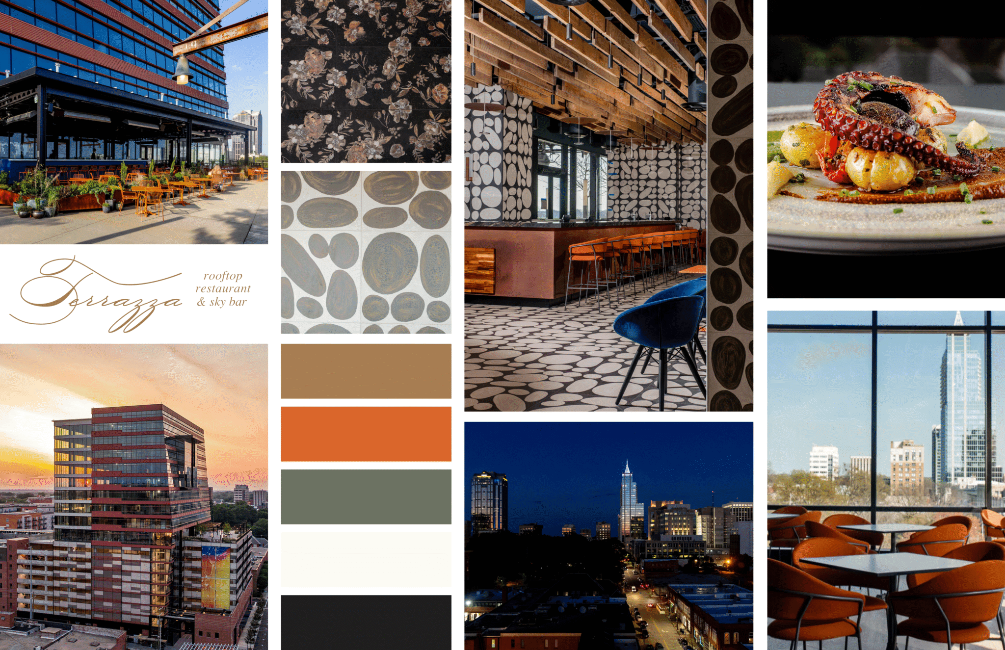
La Terrazza, a new rooftop restaurant under Umbria Hospitality Group, opened in May 2024 in downtown Raleigh, N.C. The objective was to create an elegant, mobile-friendly website that introduced the new brand, reflected the dining experience, and made it easy for guests to reserve a table.
As the sole designer, I led the project from concept to launch, creating a mobile-friendly website that balanced elegance with usability.
Challenge
La Terrazza was a completely new restaurant brand, so the website had to establish its identity from the ground up. The goal was to design a digital experience that captured the rooftop atmosphere while keeping the interface simple and intuitive.
The site also needed to fit within Umbria Hospitality Group’s overall brand family while standing out as a distinct, elevated concept.
Approach
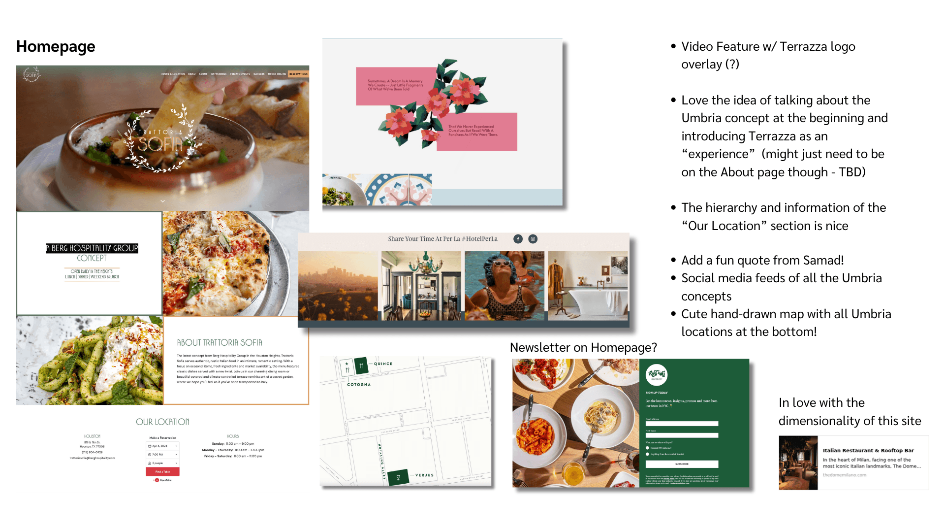
To guide the design, my team and I reviewed restaurant websites in the Raleigh area and similar rooftop dining concepts. The most effective examples used strong imagery, minimal navigation, and clear calls to action for reservations.
From this, I focused on creating a clean, mobile-first layout that prioritized visual storytelling and usability. The structure emphasized atmosphere, menu, and reservations as the three core user goals.
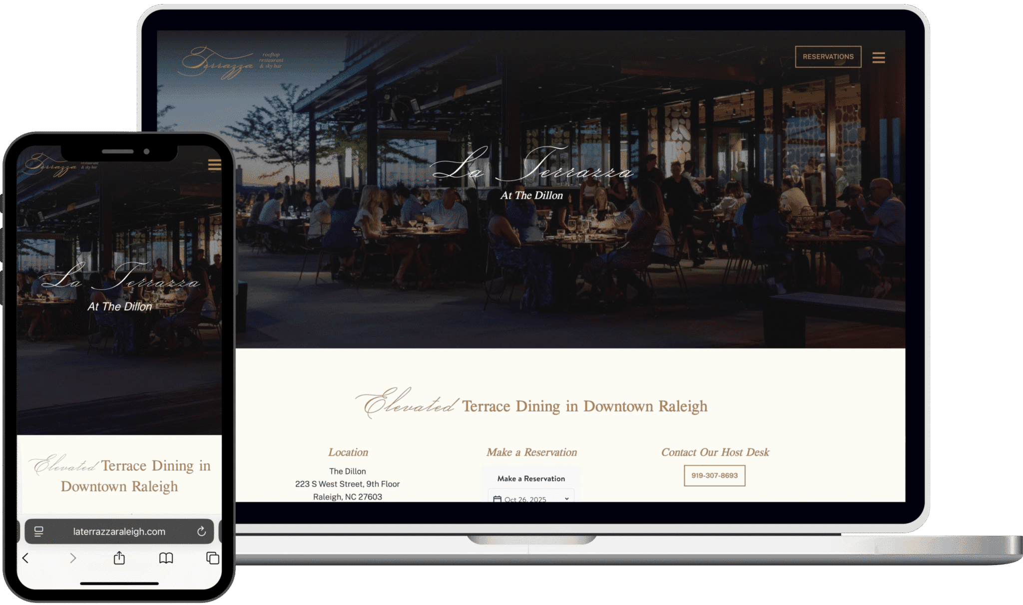
Outcome
The final site launched alongside La Terrazza’s grand opening, establishing a strong digital presence and smooth user flow. Reservation CTAs were strategically placed throughout the site to encourage engagement without disrupting the experience. The modular WordPress blocks allow the client to update menus and events easily without developer support.
Making a Reservation
Menu + Drinks Page Walkthrough
Refinements
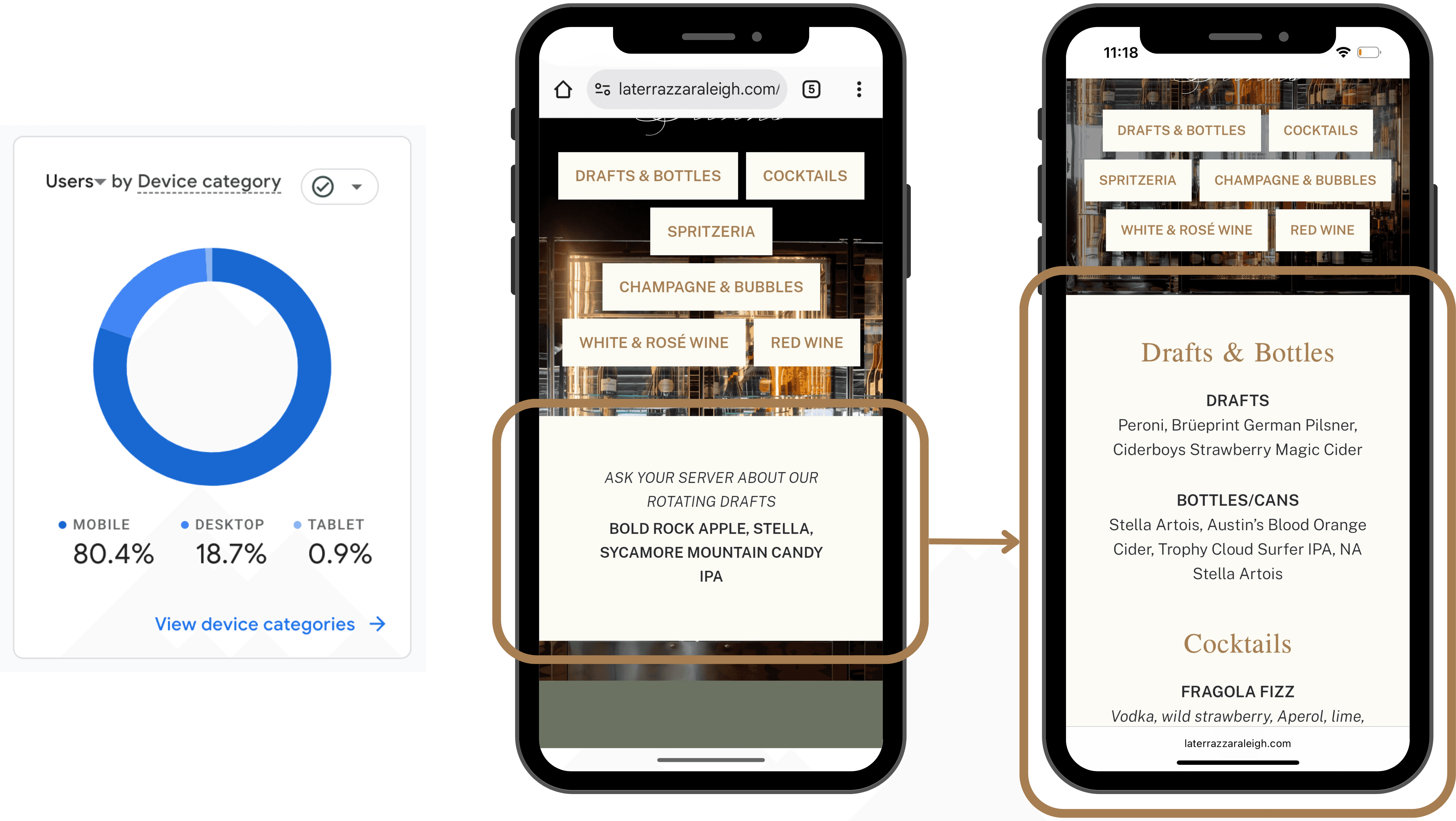
After launch, analytics showed that 80% of visitors accessed the site on mobile, validating the mobile-first design approach. Based on ongoing user behavior and feedback, I further refined the mobile experience, including a recent update to the drinks page to enhance content organization and usability on smaller screens.
Originally, users had to tap through category buttons to view each section of the Drinks menu. The updated design on the right loads the entire menu at once, giving users the choice to scroll or quickly navigate by category.
Final Thoughts
The La Terrazza project combined brand storytelling, UX design, and technical implementation into a cohesive web experience. It reinforced the value of designing for flexibility—building modular, mobile-first components that can adapt as content and user needs evolve.